
A shared experience truly makes us human. The sun rises from the east and sets in the west. The sky is blue. So are the oceans. Colors, shapes, smells, they all plug into our memories in different ways. This is the root of symbolism and interpretation. Unsurprising, then, that it is also the root of computer use.
Semiotics is the structured investigation of stimulus, reaction, and its middleground: cognition. The US, of course, undercovers the topic. I mean that figuratively and literally. The discipline is huge in Europe, South America, and elsewhere.
Whatever attention it receives, however, numerous industries depend on insight from semiotics. This obviously includes tech. We have users to consider! Their concerns and perspectives should take priority.
Semiotics: A Quick History
The study of symbolism predates history. Widely regarded author and semioticianUmberto Eco argues the discipline is implicit in all philosophies and theories. And to be fair, Aristotle, Confucius, and other foundational thinkers touch upon it in their spiritual texts.
But semiotics first gained modern credence and definition in the 19th century. Thanks Charles Sanders Peirce! A logician with few peers, he set out to define signs that effect human interaction. There is plenty of phenomenological mumbo-jumbo thrown into Peirce’s work too. Don’t get me wrong, though. Establishing internal definitions on the “nature of being” and other haughty subjects is necessary. For designers, writers, artists, etc., though, the most important element is understanding how people react to stimulus.
And that Cockroach Guy?
If Franz Kafka knew anything, it was symbolism. An early 20th century master of short fiction, Kafka actually worked as an insurance spook. The author spent much of his time investigating claims relating to on-site accidents. He also rapidly climbed up the ladder. Why? His ability to resolve claims and assess risk. This attention to risk paid off in other ways. For instance, Kafka successfully ran Germany’s first Asbestos factory. Splendid!
Now how do we prevent accidents? Careful planning, yes. But Kafka was also a product of his times. Correlating natural processes with efficiency was all the rage. Such planning includes careful attention to signage. Want to prevent yet another worker slipping from condensation on the floor? Add a sign: a big, red one that attracts the eyes.
Fascinating. What Does that Mean for Designers?
Kafka’s literary work are compelling examples. They demonstrate semiotics to a tee. Perception is all-important in his short stories. These are hilarious, depressive, or both. Whatever our reaction, Kafka places significant attention how we filter stimuli. Signs we find beautiful and promising warp into threatening and morose. Object attachment, psychosomatic reactions to stimulus, consistent narrative metaphors, etc., are all present. Ironically, we all can learn about consistent user experience from Kafka.
Now don’t get me wrong. His “attitude problem” is hardly conducive for pleasant computer use. Can you imagine? That mentioned, the mood cannot discount his narrative control. Big league platforms use the method lots and lots.
Facebook’s neutral positivism is perhaps the best example. Users are free to voice their dislike of posts, yes. Ever receive a prompt from Facebook to do this? Nope. We can officially “Like” or “Share” a post. In fact, those suggestions pop up with every update. “Disliking” or “Ignoring” posts? Not yet. Probably not ever. Ironically, Facebook is Kafkaesque. Even more importantly, all designers too should probably strive for that same sense of continuity.
Semiotics Today
The school of semiotics is comprehensive. As the academic discipline of meaning, it is also quite huge. There are plenty of elements that constitute how we understand our world. For the purposes of this post, however, let us examine the simple categorization that Wikipedia uses.
- Semantics: What signs denote and their relation to things they refer towards
- Syntactics: Relation of signs in a formal structure
- Pragmatics: How signs are interpreted across culture and scenario
Now these are very general. Linguists in particular will likely recognize intersections. This is for good reason. Signs include sounds. Semiotics, of course, is more cohesive. All stimulus plays a role in semiosis, or the construction of meaning.
It hardly matter what we call semiotics. In the U.S., for instance, it is subcategorized into linguistics, psychology, zooology, etc. Whatever we call or section it does not make semiotics any less potent. The discipline is as inescapable as communication. It can be your best friend or worst enemy. Steve Jobs certainly knew that.
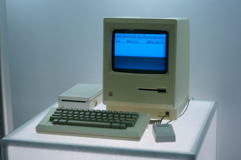
Thanks for the pic, Marcin Wichar!
Integration, Digitization
Accessibility was greatest hurdle of late 20th century computing. Hardware had developed to the point where something usable, even purty, and could sit atop a regular desk. Jobs is not the only pioneer of his field. Plenty worked to make computing more accessible. What makes Job particularly of note, then? His freakishness.
Jobs took three classes at Reed before dropping out. Ready for them? Shakespeare, calligraphy, and dance. These do not directly relate to computing. They do relate to how humanity “do.”
From synchronicity to reflexiveness, Jobs helped perfect the consumer PC in the early 80s. Though foundational, these innovations are not a big deal today. But his suggestions and innovations were groundbreaking for the era.
Programmers were used to coding for computers that… exclusively used code. Figuring out UIs that regular users could understand, let alone enjoy? That was a different story. There are plenty of histories that cover Apple’s rise. The significance is that they all feature consideration of semiotics. How will average consumers use a computer? More intrinsically, what sort of prompts can they assimilate for a smooth, intuitive experience?
Usability: The Crux of Any Good Application
Applications need to be useful. They also need to be accessible. Perhaps the biggest break between function and actuality? Intuitiveness. The best software has fluid controls and clear options. Users should be able to open the application and instantly use it. Any concept of a “learning experience” is slowly going out the window.
Even professional-caliber SaaS emphasizes streamlined usability. Platforms for market research, automatic server maintenance, presentations, and more are simplifying controls. They also have been using similar icons for years.
Such a strategy can make platforms seem generic. They also ensconce the user in a continuous experience. Learn one application and a dozen more become accessible. An immediate example is the drop-down menu. Mundane? Sure. But it also appears in just about every application. Put like a semiotician, it is part of computer users’ general syntax.
Maintaining these expectations and habits is crucial. Altering base habits or controls can be disastrous. At the very least, it will require a greater learning curve. Just because applications do different things does not mean they need different controls. Far from it. Respecting the continuity of the user experience is all important.
Narrative: The Kicker
Now there are two options when replicating controls, icons, and other signals. First, designers can make them unquestionably conformist. The only hangup? The application is probably doing something unique that precludes exact conformity. The second option, meanwhile, is to explore user experiences…if not build off them.
This is exactly how professional design suites differentiate themselves. Options will be the same, but their location on the menu? Not so much. Users can still find continuity, for whatever reason.
Most likely because functions are the same across the board. This implies a consensus as to what is most effective for design. The same can be said for spreadsheets, word processors, and SaaS platforms. Logic goes that any application looking for immediate success will look to precedent, at least for layout.
Respecting the narrative experience is one thing. Creating it is quite another. The most intrinsic element is realizing user expectations. Facebook and other monolithes prove limiting options can expand horizons. Kafka lived such a reality. The real trick is adding a new spoke to the old wheel. Even doing this, though, requires understanding user habits and expectations. Semiotics is a bridge to that mindset.
Images courtesy of Marajim and Marcin Wichary via creative commons


