Disruptive B2B SaaS is a dime a dozen. Now don’t get me wrong. The good stuff actually improves its clients’ generation, processing, output, or whatever else. Even so-so applications aren’t necessarily devastating…just a 2.0 GPA. Think stuff that adds unnecessary components or otherwise complicates navigation without offering a concrete benefit.
Relevancy, of course, matters a ton. When has it not? Within the search for said relevance, however, there is also brand. This is where following convention can become tricky. Does “fitting in” or “standing out” matter more? What happens when it tries both? Is that a strategic roadmap? A balancing act? These are important questions…but often the wrong ones.
Communication is critical. And not to be that pretentious, but all communication is derivative. AT&T uses the same font as the U.S. Federal Highway system for a reason. Ditto for Google and their multi color font – schools adoption of it was quick in its early years. It elicits a tree of associations that users often cross-apply, at least in the back of their mind.
Of course, the associations depend on niche as much the appeal. AT&T is predominantly B2C. Ditto for Google. Not that both don’t also foster businesses and other organizations. It’s just that their revenue is more a result of use rather than facilitation. AT&T and Google both benefit from cellular technology and big data, work to swallow and co-opt “disruptiveness,” etc. to continue appealing to customers.
Successful B2B SaaS startups adopt similar positioning -they must recognize data highways and traffic trends. Instead of controlling the disruptiveness, however, they incubate it so that bigger fish, whales even, may swallow it whole later. The first rule of success in this? Initiating a positive change. Advertising such often means acknowledging similarities and using style to communicate it. Perhaps one of the biggest case-in-points is oDesk’s switching to “Upwork.”
The change implies a new direction, sure. However, how often were newer, more aggressive startups branding themselves with an “O” or an “E?” Not too often. To make itself appear, at least, to offer a superior solution it needed a name that also implied it. “Upwork” isn’t a complete rip of “UpCouncil” and co, but it does imply a more skill-oriented approach. In fact, the freelance site must still be reeling that more selective “talent clouds” eclipse its own solutions.
There’s more to branding that mere replication. There is also sectioning. What makes a given solution distinct? What features a prominent and why? These all plug into overall brand. Style conveys substance. Of course, that does not mean the latter doesn’t also matter a great deal. In fact, the solution itself does more to fulfill brand than font or style -that is merely its expression, potent as it is.
It’s popular to mention that branding and market relevance matter more than software quality. And this is true…to a point. But getting prospects to actually use a platform, and keep using it, depends on said quality. Usefulness, above all else, is what brand should actually convey.
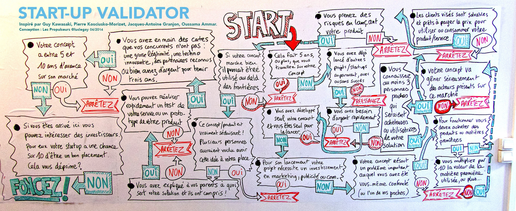
Picture courtesy of Luc Legay via Creative Commons


